From the beginning, the brand needed a visual system that reflected its values: modern yet grounded, soft but unshakable. We partnered with Hayaa to craft an identity that feels graceful, confident, and deeply rooted in purpose.
Challenges
No existing identity; the brand needed to be built from scratch
Required a logo system that worked across signage, packaging, and mobile screens
Needed to communicate warmth, trust, and reliability without feeling too generic
Visuals had to be flexible and easy to implement across future touchpoints and locations
Strategy
Logo Design & Visual System
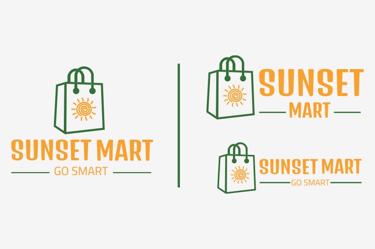
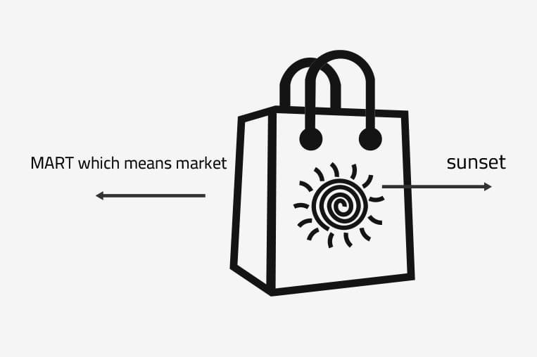
Developed a clean, balanced wordmark for “Sunset Mart” with modern, rounded typography
Integrated a subtle sun motif within the type to reflect optimism, warmth, and everyday ease
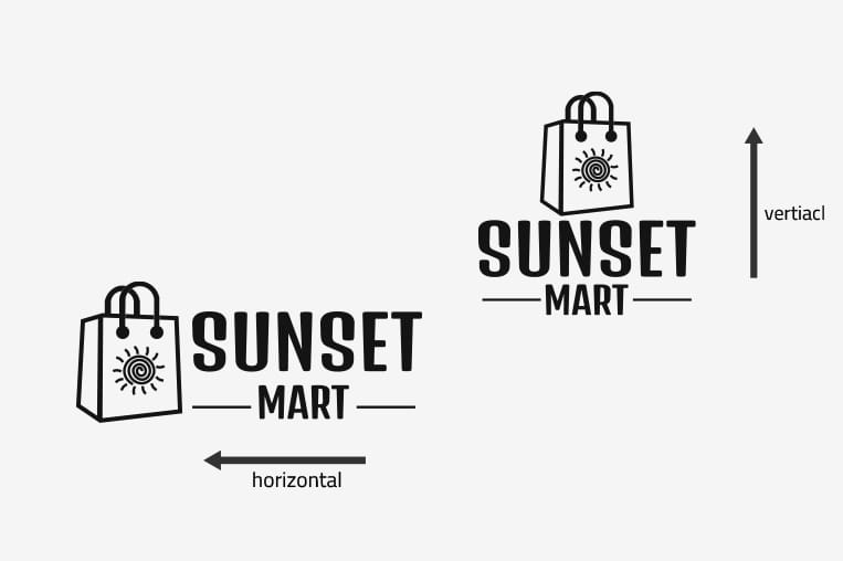
Built a logo system with both horizontal and vertical lockups for maximum versatility
Color Palette & Iconography
Introduced a bright, modern color palette:
Warm orange and golden tones to evoke sunshine, positivity, and approachability
Neutral accents (charcoal, soft grey) for contrast and legibilit
Designed a full icon set to support digital platforms, helping users navigate with clarity
Brand Extensions & Mockups
Created usage examples for storefront signage, packaging, tote bags, receipts, and delivery boxes
Ensured the identity system was simple to apply; even for non-designers handling in-store visuals
Results
Delivered a vibrant, scalable brand identity ready for retail, digital, and marketing use
Helped position Sunset Mart as a feel-good, everyday brand with professional polish
Developed a system that allows easy brand rollout across new locations and products
Gave the internal team a clear, easy-to-use brand kit for growth
Conclusion
Sunset Mart’s identity is proof that simplicity, when done right, can be powerful. With bold clarity, friendly energy, and a system designed to grow, we helped the brand create a foundation that feels just as fresh as the shelves it fills; every day, every aisle.